Today we were split into groups to complete Part 3 of the brief. We were split into groups and were required to research and generate ideas for the development of new packaging for Animal Clothing’s watches throughout the day (which would be presented at the end of the day), after which we would move on to Part 4 of the Visual Communication in Context 2 where we would be required to develop ideas individually from our group’s ideas to a finished, professional standard.
I think we worked relatively well as a group. We concentrated mainly on Animal as a company and their existing target audience, lifestyle, history and their current range of products. We also looked into the company’s design style and its main competitors (which we decided were companies like Quicksilver, O’Neil, and Rip Curl).
We all assigned ourselves different research points to fairly share out the work throughout the day and by the end of the day had a presentation of 7 or 8 slides. I think we worked relatively well as a group although I felt if we had been more focused we would have got a far more coherent and useful set of research for us to each individually work on for the fourth part of the assignment. I also felt that we concentrated too much on research existing ideas, styles and information instead of working more to develop some very rough ideas and concepts for our individual ideas.
That said our presentation went quite well and we were able to explain where we had got to clearly using the slides we had made throughout the day. I feel that due to completing this group work session I have a route to work down for my design (all be it a rather shaky start).
25.10.08
Some new card ideas?
Just an idea for a new set of punk cards I came up with. I think I will try and complete a second set of six as I thoroughly enjoyed the brief and although I am happy with set of six I have already produced I feel I could push the idea of punk greetings cards alot further!


24.10.08
Final Critique
I found the critique today pretty good, with some relatively good feedback from Neil, Claire and Sally (although I also found that I could have recieved much of the new feedback yesterday to allow me to complete the newly mentioned additions or changes).
I also felt that there was little point in having an interim critique a day before the final critique because it gave me and my classmates very little time to adapt or change our idea should anything have been badly wrong.
I plan to modify my cards or even create a new set by the time of the final hand in date but this remains to be seen as I do not know how much free time I will get before then. I have included a photograph of my set of six cards which I presented today at the critique.

23.10.08
Interim Critique
I arrived at the interim critique with my set of six printed, but not completed (somewhere for a stamp, somewhere to write a short note or a To: and From: sections, envelopes and potentially a box or container for the cards to be presented and sold in).
Firstly some of the cards I saw during the critique were superb, extremely well thought ideas and executions. The feedback I received from Neil and Claire during the critique was good, with only small amounts of work (much of the changes were predetermined) still requiring completion. Namely the additions mentioned above. I decided I would produce the envelopes for the final critique and spend whatever time left considering changes to better my cards within the time provided before the final hand in.
All in all a good day with some good feed back!!
21.10.08
Cracking on...!
I have just been cracking on with the cards since the critique. I had planned to get the imagery for each card by photocopying my collage, however none of the people at the AIB in charge of photocopiers were particularly welcoming about me feeding 300gsm card through their photocopiers. I began to experiment with live tracing my collage in illustrator (a task far more difficult than I would have originally imagined) using the various settings to get as many levels out of the scanned collage as possible.
20.10.08
Collages Completed! Phew!!
After a huge amount of trawling through the mass of single and album releases featured on the Punk Sleeves website I was able to obtain a selection of the well known or better designed covers from the more influential punk years. This was followed by a huge amount of cutting, positioning and sticking (some un-sticking and repositioning in there too).
I am extremely pleased with how my collages have worked out and am also feeling good with the progress I am making on this brief as I have learnt a huge amount about Punk music and the culture that surrounds it as well as a huge amount of inspiration in terms of the design styles and techniques used to produce the huge variety of punk releases from ‘76 - ’84. These design methods include photocopies, to hand illustrated (by designers and band members), to professionally designed, type set pieces (by the likes of (Barney Bubble (Ian Drury and the Blockheads), Jamie Reid (Sex Pistols), Ray Lowry (The Clash) and Malcolm Garrett (The Buzzcocks)).
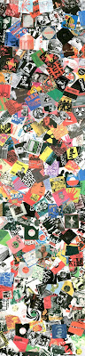
I Have separated up the album art on my collage into three groups ‘76 - ‘78, ‘79 - ‘81, ‘82 - ’84 to break up the different styles (and bands prominent at each time).I hope these collages will work to create imagery which is indicative and appeals to my chosen target audience, Punks and other enthusiastic. I have created three collages, each of about A2 in size with an estimated 300 + record sleeves present in total, I have included a scan below of the completed collages.
I am extremely pleased with how my collages have worked out and am also feeling good with the progress I am making on this brief as I have learnt a huge amount about Punk music and the culture that surrounds it as well as a huge amount of inspiration in terms of the design styles and techniques used to produce the huge variety of punk releases from ‘76 - ’84. These design methods include photocopies, to hand illustrated (by designers and band members), to professionally designed, type set pieces (by the likes of (Barney Bubble (Ian Drury and the Blockheads), Jamie Reid (Sex Pistols), Ray Lowry (The Clash) and Malcolm Garrett (The Buzzcocks)).
I Have separated up the album art on my collage into three groups ‘76 - ‘78, ‘79 - ‘81, ‘82 - ’84 to break up the different styles (and bands prominent at each time).I hope these collages will work to create imagery which is indicative and appeals to my chosen target audience, Punks and other enthusiastic. I have created three collages, each of about A2 in size with an estimated 300 + record sleeves present in total, I have included a scan below of the completed collages.

18.10.08
Working on cards
After working on my cards since the ideas discussions last Thursday and Friday I have been concentrating on collecting together objects which are unmistakeably classic UK Punk. After considering objects and where I would be able to obtain enough material to create a strong collage, Neil introduced me to a website created by his current tutor, Russell Bestley (who has a PhD in Punk). The website is a study and interactive matrix of British punk album covers from the classic era of the emergence of the genre in this country (through the years of 1976 - 1984). The sites interactivity comes from the various filters (years, styles and locations) which can be applied to the matrix to provide similar sets of releases.

www.punksleeves.com
The site is a huge database of the releases throughout these classic and predominant years of the punk movement and to be honest even if you hate punk music it’s worth a look! And alternatively if you do like punk music and the surrounding movement its even better because each of the album covers feature a short sound bite of the specific release!! This site makes me wish I had been around to see this heavily influential time in music, youth culture and society stuck in a rut. I have decided that I will create my collage from the hundreds of punk releases featured on this site. Once I have created a decent collage which will allow me to obtain six card designs from I will post my designs.
Note: My previous collage of the punk flyers I put together were all traditional punk produced. What I mean from this is that the designs have been photocopied onto plain paper (colour or white). This is a cheap and concise way of reproducing a design and is extremely indicative of punk style. I have produced a mock up card from my original collage which is posted below!
17.10.08
Crits, Cards, Punks and Other Stuff
Well, today was a really useful day for myself (and my classmates I imagine), as we recieved plenty of feedback and other information about various goings ons.
To start with I was chosen as one of the first group to discuss our previous submissions of the A3 Look Again/Think Again posters we had finalised for the previous Thursday. This critique was led by Sally who was unaware of who had done what work or the implications and messages behind each poster. I felt my poster came across well and was easily understood. I thought running the critique this way was a good but felt it could have been improved if a member of the general public had been brought in (as opposed to another member of staff as they would already have design experience) to see if they understood each poster and to see how stronger message each poster portrayed as this w0ould give us an idea of how each of our ideas would have been percieved by members of the general public. Although this might not be the easiest sort of critique to organise it may be worth considering for future discussions as the most valuable opinion can often be of the public especially when they are the target audience. Overall I am pleased with my idea and will continue to develop the ideas presented t0 me in this and the first critique to improve my work however, the differences in opinions between the critiques make me unsure of how much needs to be changed?
Next, in small groups we were to discuss our ideas of concept, target audience and rough visual style and route which we plan to go down for our newest course brief (The greetings cards) with Neil and Clare. This was extremely valuable to everyone as it allowed the class to voice their opinions on peoples work and give each other new ideas or variations on existing ideas. I also found having Neil and Clares opinions, ideas and advice extremely useful as when I mentioned my idea we were able to have a lengthy discussion just about various routes I could go down which in turn has changed me from worrying about this project to being quite excited as to what I could end up with by the final critique date.

Overall I came out of the ideas discussion stumbling blindly down a path which I had not even realised existed. Ya see, when explaining my ideas and presenting my mood board/collage of punk flyers to the class, it was brought to my attention that I had already started a perfectly good experimentation into the art and ideas surrounding the subject by creating the collage. I think I will maybe go down this route, of collaging imagery into a huge mass of interesting and eye catching subject matter, specifically aimed towards a genre of music and its ideas. The great thing about deciding to continue down this route is that I have my idea now, and feel that although the set of six must be clearly indicative of one target audience, that does not mean it cant appeal to a larger target audience, through an interesting and innovative design... Time to continue with my consideration of visualisations. Possibly collage!!
13.10.08
Decision Made! PUNK!! PUNK!! PUNK!!
Just a quick post to say I have decided that my target audience will be punks, punk music enthusiasts, as well as many more! So PUNK its is for the subject of the cards! Will post when I have more to show!
12.10.08
Live Briefs/Wasted Weekend... Oh my god!!
Ugh, I haven't done any work since Friday and it makes me feel terrible, I feel like I can't afford to have any time off... It must just be because its the beginning of the year and I'm not really back into the swing of things, but even so...
Just read through the ISTD briefs and they literally made my head hurt, ill avanother look tommorrow...
Just read through the ISTD briefs and they literally made my head hurt, ill avanother look tommorrow...
10.10.08
Introductory Lecture and New Brief
Today we had a short introduction by Clare, a professional illustrator, textile and graphic designer who has been working in the field of greetings cards, wrapping papers and seemingly everything else which comes into this sector of design. I found her work interesting and motivating, especially her work based around St. Ives. The care and attention that goes into her work is stunning, as well as the handmade elements of much of her work which I found extremely inspiring as it is not really something I have ever considered doing. Her more recent work also intrigued me as when looking for cards for various occasions I have often wondered who designs this type of work. I hope to discuss my ideas with her in the coming week as I feel I would be able to gain a much better understanding of where to aim at with this project (A set of six greetings cards) by doing so.
The new brief looks like it could be a tough one to really get focused on, but none the less I will try my best. After discussing ideas with Neil, my first thoughts are that I would like to work within type for the cards as I like the idea of being able to say as much with type as I can with image. The possibility of quotes is the first direction I plan to head in for this brief, but before deciding on a technique or visualisation I must ensure I work the right way round and gain an insight into some design I really like and then focusing on a target audience to guide my work in the correct sort of direction.
Also the next post will hopefully have details of which live brief I had decided to undertake as well as my progress on this next part of the current brief!
Note: I must remember to keep up to date with PPRD as I do not want to have to recount what has happened over a time period as ideas, concepts, discussions and other elements of my learning become lost if they are not carefully documented.
9.10.08
Look Again/Think Again Critique
 I felt the critique today went reasonably well as after discussing my work with Neil and my classmates, I feel I can improve my work making it a more concise and coherent visualisation, thus further bettering the chances of my piece of work raising awareness for the relevant subject – Dementia and more precisely, the most common form of Dementia, Alzheimer’s disease. From what I gathered from the comments my imagery was along the right lines but needs a few vital elements to make it work well alongside my strap line, namely the addition of the human element being unable to tie the shoes within the visualisation of the idea.
 I was somewhat disheartened by the fact that the background image of a aging and fading brick wall did not seem to imply the same message to people as it had done to me so vividly, connecting with the bleakness and forgetfulness which is associated with Alzheimer’s. However for the designer of a piece of work it is easy to see the intended meanings while for members of the general public (which the advert is aimed at) it may not be as easy to see.
However it is my work, and I feel the brick background adds something to the image even if it is just an issue of being aesthetically pleasing. However I will consider the background which I place the image elements of a design in future. I must consider my context and target audience more!!
I have also taken on board the points various people made about the legibility of the strap line as on screen this was far more readable than the print version. I almost find myself wishing that the poster was far larger than A3 because I was very pleased with the type, however if the masses think it is on the boundary of illegibility then it has to change whether I like it or not as the design is not for me, it is to raise a awareness of a social issue which has been overlooked by the public.
I simply cannot rest, or start the next part of the brief before I have made these certain changes as I want my second year to start on a good note, in which I am content and pleased with the work I produce, and thus improved my relatively poor confidence. Therefore I will redo aspects of the visualisation to ensure that the piece of design is clear and is able to reach as broader audience as possible. As soon as I have completed the altered elements of my visualisation I will post the new and improved piece.
Note: I must learn to take criticism of my work much better than I have in the past, however, I will continue to defend my work in terms of answering queries which are put to me about the reasoning behind my work and the various elements I choose to include because this is the task of a designer when discussing their work. Until next time. Ciao
6.10.08
Finally some passion < - - - -
After researching into the subject of Dementia and the most common form, Alzheimer’s disease, I have been extremely pleased. Not necessarily because I have done a truck load of work (I wish...) but more because I have found myself becoming extremely interested and passionate in a subject which I am researching and am therefore determined to create a strong visualisation for the critique session on Thursday. If it crashes and burns then I will continue to develop it until it is of a strong standard.
The more and more I looked into the subject matter, I found myself getting somewhat angry at myself for not really knowing what Alzheimer’s disease was, even though it is an extremely serious problem. (In fact if someone had asked me what it was, I probably would have told them that it’s that disease/disorder where you can’t sleep, so zero points for prior knowledge Chris...). So with that said, even if my visualisation is an absolute failure, at least by working on the brief I have managed to raise awareness of the issue to myself.
Currently I am considering a strong yet simple way of raising awareness of the chosen issue by presenting the message that everyday tasks, skills and memories become lost by sufferers of the disease...
Everything Has Changed...
OK so over the weekend I have considered the brief a lot in my head and have decided to develop my existing idea into a social issue. This has happened by me considering the opposite to remembering the first time you did certain things, forgetting how to do things. I began considering this and decided that I would much rather produce a poster to raise awareness of a social issue. The issue I have chosen to raise awareness of is that of Dementia and more precisely, the most common form of Dementia; Alzheimer’s disease. Interesting how an idea can develop into something totally different just by a heavy session of mental thinking isn’t it?
So the next step is to begin learning something about Alzheimer’s...
So the next step is to begin learning something about Alzheimer’s...
2.10.08
Here We Go Again / First Brief (Task One - Look Again/Think Again)
Our first official studio day was relatively nerve wracking for me as I knew we would be receiving a new brief. I was not wrong. The first brief for this year is Visual Communication In Context 2. The brief is made up of four parts with the first task - Look Again/Think Again. The final outcome is an A3 poster which makes the audience Look Again or Think Again with the group critique of our final outcomes happening within a week’s time.
If the truth be known I was wishing for a week long brief as it is a relatively short amount of time to produce a piece of work based on a concise idea or concept while working within the context of the task – Look Again/Think Again, and of course with only a week, I should be jolted into action. Sadly after brainstorming the examples given to us for ideas (An over looked social issue or a more personal object which is emotive) I am no further forward. I am also perplexed at how when asked if I understand, I nod and agree and then directly after I look again at the brief and realise I do not really understand... ARGGHH!!
My initial thoughts are that it would be easier to complete a brief based around a social issue as opposed to a personal object but that the latter could quite possibly produce a more interesting design solution, but who knows. I hope to have feasible ideas for both by this coming weekend allowing me to have a choice as to what my concept will be based around. Will continue to brainstorm ideas and discuss with classmates and lecturers to build an idea. Also I plan to take a broad look at advertising design to gain a better understanding of tactics used to produce memorable and thought provoking design. Perhaps I should be careful what I wish for...
Subscribe to:
Posts (Atom)