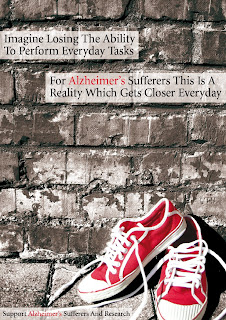
 I felt the critique today went reasonably well as after discussing my work with Neil and my classmates, I feel I can improve my work making it a more concise and coherent visualisation, thus further bettering the chances of my piece of work raising awareness for the relevant subject – Dementia and more precisely, the most common form of Dementia, Alzheimer’s disease. From what I gathered from the comments my imagery was along the right lines but needs a few vital elements to make it work well alongside my strap line, namely the addition of the human element being unable to tie the shoes within the visualisation of the idea.
 I was somewhat disheartened by the fact that the background image of a aging and fading brick wall did not seem to imply the same message to people as it had done to me so vividly, connecting with the bleakness and forgetfulness which is associated with Alzheimer’s. However for the designer of a piece of work it is easy to see the intended meanings while for members of the general public (which the advert is aimed at) it may not be as easy to see.
However it is my work, and I feel the brick background adds something to the image even if it is just an issue of being aesthetically pleasing. However I will consider the background which I place the image elements of a design in future. I must consider my context and target audience more!!
I have also taken on board the points various people made about the legibility of the strap line as on screen this was far more readable than the print version. I almost find myself wishing that the poster was far larger than A3 because I was very pleased with the type, however if the masses think it is on the boundary of illegibility then it has to change whether I like it or not as the design is not for me, it is to raise a awareness of a social issue which has been overlooked by the public.
I simply cannot rest, or start the next part of the brief before I have made these certain changes as I want my second year to start on a good note, in which I am content and pleased with the work I produce, and thus improved my relatively poor confidence. Therefore I will redo aspects of the visualisation to ensure that the piece of design is clear and is able to reach as broader audience as possible. As soon as I have completed the altered elements of my visualisation I will post the new and improved piece.
Note: I must learn to take criticism of my work much better than I have in the past, however, I will continue to defend my work in terms of answering queries which are put to me about the reasoning behind my work and the various elements I choose to include because this is the task of a designer when discussing their work. Until next time. Ciao

No comments:
Post a Comment